A Practical WCAG 2.2 Accessibility Testing Checklist
A WCAG 2.2 checklist is a structured test pass that walks an application through the four accessibility principles — Perceivable, Operable, Understandable, Robust — and verifies each applicable success criterion at Level A and AA. WCAG 2.2 was published as a W3C Recommendation on October 5, 2023 and adds nine new success criteria on top of WCAG 2.1, covering focus visibility, dragging alternatives, minimum target size, consistent help, redundant entry, and accessible authentication. The checklist below is the one most QA teams actually run before release — Axe DevTools for the automated sweep, then a manual pass with NVDA on Windows or VoiceOver on macOS.
Key takeaways
- WCAG 2.2 contains 86 success criteria — 50 at Level A/AA, the rest at AAA. Level AA is the legal target almost everywhere.
- Nine new criteria in 2.2: 2.4.11, 2.4.12, 2.4.13, 2.5.7, 2.5.8, 3.2.6, 3.3.7, 3.3.8, 3.3.9. The previous 4.1.1 Parsing was removed as obsolete.
- Automated tools find roughly 57% of accessibility issues on first-pass audits according to Deque's 2024 coverage study — the rest needs a keyboard and a screen reader.
- The European Accessibility Act went live on June 28, 2025 (referencing WCAG 2.1 AA via EN 301 549). The U.S. DOJ Title II deadline was extended in April 2026 to April 26, 2027 for state and local entities with populations of 50,000+.
How to use this checklist
Each section covers one of the four WCAG 2.2 principles. The criterion number — for example, 1.4.3 Contrast (Minimum) — points back to the official W3C definition, the level (A, AA, AAA) tells you whether it is in scope, and the bullets describe how the criterion actually fails in production. Most legal regimes set Level AA as the bar, so Level A and AA are the priority.
Before you start, set up a keyboard, a screen reader (NVDA on Windows or VoiceOver on macOS/iOS for primary coverage; JAWS for enterprise, TalkBack for Android), the Axe DevTools Chrome extension, and browser DevTools with the Accessibility tab open. For every failure, capture the criterion number, the affected component, the AT and browser combination, and reproduction steps.
Principle 1: Perceivable
Information and UI components must be available to the senses. Content that only works visually, or only with sound, fails Perceivable.
1.1.1 Non-text Content (A) — Every non-decorative image, icon, and graphic needs a text alternative. Decorative images use alt="" so screen readers skip them. Audit fast by disabling images in the browser and checking that the page still communicates everything.
- Informative images have descriptive
alttext - Decorative images use
alt=""— not "decorative", not a filename - Icon buttons have
aria-labelor visually hidden text - Charts and dashboards ship with a text equivalent nearby
1.2.2 Captions / 1.2.3 Audio Description (A) — Prerecorded video with audio needs synchronised captions; audio-only content needs a transcript. Auto-generated YouTube captions only meet this criterion once a human has corrected them.
1.3.1 Info and Relationships (A) — Visual structure must be matched by programmatic structure: <h1>–<h6> for headings, <ul>/<ol> for lists, <th scope="col"> for table headers, <label for="…"> for form fields. Styled <div>s do not communicate structure to a screen reader.
1.4.1 Use of Color (A) — Colour alone cannot carry meaning. A red form-field border signals an error only to users who can perceive that red.
- Validation errors use a text label or icon as well as colour
- Required fields are not marked solely by a red asterisk
- Status indicators use text or shape in addition to colour
- In-text links are distinguishable by something other than colour — underline is the convention
1.4.3 Contrast (Minimum) (AA) — Body text needs 4.5:1; large text (18pt or 14pt bold) needs 3:1. Check every text/background combination in the design system. Placeholder text is the most commonly failed instance.
- Body text meets 4.5:1; large text meets 3:1
- Placeholder text meets the same thresholds
- Text over photographs, gradients, or video meets the threshold at every viewport
- Disabled controls are exempt — confirm they are genuinely non-functional first
1.4.10 Reflow (AA) — Content reflows into a single column at 320 CSS pixels wide (1280px scaled to 400%). Users zooming on mobile must not have to scroll horizontally to read body content.
- No horizontal scrolling at 320px
- Data tables and code blocks that cannot reflow are wrapped in a horizontal-scroll container — explicit exception
- No content disappears or gets truncated
1.4.11 Non-text Contrast (AA) — UI component boundaries, focus rings, and meaningful icons must hit 3:1 against adjacent colours. Soft grey form-field borders on white usually fail here.
1.4.12 Text Spacing (AA) — When a user overrides line height, paragraph spacing, letter spacing, or word spacing, nothing should clip, overlap, or vanish. The W3C bookmarklet applies the maximum values — run it across critical pages.
1.4.13 Content on Hover or Focus (AA) — Tooltips and popovers triggered by hover or focus must be dismissible (Escape), hoverable (you can move into them without them vanishing), and persistent (they stay until dismissed or focus moves).
Principle 2: Operable
Every interactive element must work through more than one input mode. If a feature only works with a mouse, it fails Operable.
2.1.1 Keyboard (A) — Every action available with a mouse must be available with a keyboard. This is the single most common failure in modern SPAs. Custom widgets — date pickers, comboboxes, sliders, drag-and-drop, virtualised lists — need explicit keyboard implementations.
- Every interactive element is reachable with Tab
- Custom dropdowns open with Enter or Space, navigate with arrows, close with Escape
- Date pickers expose Tab + arrows
- Drag-and-drop has a keyboard alternative
- Modals open with Enter and close with Escape
2.1.2 No Keyboard Trap (A) — Focus must always be movable away from any component. Components that intentionally trap focus (modals, drawers) provide a standard exit, typically Escape.
2.4.1 Bypass Blocks (A) — A "Skip to main content" link is the first focusable element, visible on focus, and moves focus into the main region (not just scrolls). Without it, keyboard users tab through every nav link on every page load.
2.4.2 Page Titled (A) — Each page has a unique, descriptive <title>. SPAs must update document.title on route change — the most common SPA accessibility bug.
2.4.3 Focus Order (A) — Focus moves in a sequence that preserves meaning. Dynamically injected content (modals, notifications, slide-overs) needs to receive focus at the right moment rather than being appended at the end of the DOM. Avoid tabindex values above 0.
2.4.4 Link Purpose (In Context) (A) — Link text communicates where it leads. "Click here", "Read more", "Learn more" in isolation fail. Screen reader users often pull up a list of all links on a page; in that context, generic text is meaningless.
2.4.7 Focus Visible (AA) — The focused element must be visually identifiable. The most common failure is outline: none with no custom replacement.
- Every interactive element has a visible focus state
- Custom focus styles meet 1.4.11 non-text contrast (3:1)
2.4.11 Focus Not Obscured (Minimum) (AA — NEW in 2.2) — When an element receives focus, it must not be entirely hidden behind sticky headers, cookie banners, floating chat widgets, or other author-created content. Partial obstruction is still allowed at the Minimum level — full obstruction is the failure.
2.4.12 Focus Not Obscured (Enhanced) (AAA — NEW in 2.2) — Same idea, but stricter: no part of the focused element can be obscured. AAA-only, so best-effort for most sites.
2.4.13 Focus Appearance (AAA — NEW in 2.2) — A quantitative definition of "visible enough": the indicator encloses the focused component with at least a 2-pixel-thick perimeter, and the focused/unfocused contrast is at least 3:1. Originally proposed at AA, moved to AAA during the WCAG 2.2 development cycle.
2.5.1 Pointer Gestures (A) — Any function using a multi-touch or path-based gesture (pinch, swipe, draw) must also work with a single pointer.
2.5.7 Dragging Movements (AA — NEW in 2.2) — Any function that uses a drag must also work without dragging. This patches a gap from WCAG 2.1, which only covered path-based and multi-point gestures.
- Drag-and-drop reordering has a non-drag alternative (a "Move up / Move down" menu)
- Range sliders accept arrow-key input as well as drag
- Map panning works with arrow keys or directional buttons
Keyboard accessibility alone is not enough — the W3C explicitly notes 2.5.7 is about pointer interaction. A keyboard-accessible drag interface still needs a non-drag pointer alternative.
2.5.8 Target Size (Minimum) (AA — NEW in 2.2) — Interactive targets must be 24 by 24 CSS pixels, with exceptions. Smaller targets are permitted if a 24-pixel-diameter circle centred on each does not overlap a neighbouring target. Inline text links are exempt. The older AAA criterion 2.5.5 Target Size (Enhanced) still exists at 44×44 — 2.5.8 is the AA-level cousin.
2.2.1 Timing Adjustable (A) — If a time limit is essential, users can turn it off, extend it, or the limit is at least 20 hours.
2.3.1 Three Flashes (A) — No content flashes more than three times per second. Seizure-safety criterion.
Principle 3: Understandable
Information and the operation of the interface must be understandable. Users have to comprehend the content and how to interact with it.
3.1.1 Language of Page (A) — <html lang="en"> (or the appropriate code) is set on every page. Without it, screen readers may use the wrong pronunciation engine. Passages in another language use lang on the containing element.
3.2.1 On Focus (A) — Moving focus to an element must not trigger an unexpected context change. A <select> that navigates to a new page when an option receives focus — before the user confirms — fails.
3.2.2 On Input (A) — Changing a setting must not cause an unexpected context change unless the user has been warned. The classic failure: a form that auto-submits when a radio button changes.
3.2.6 Consistent Help (A — NEW in 2.2) — When help mechanisms appear across multiple pages — a contact link, a help link, a chat widget, a phone number — they must appear in the same relative order on each page. Users with cognitive disabilities rely on consistent placement to find support.
- A "Contact us" link in the footer on page A appears in the footer on page B
- Live chat widgets sit in the same screen corner site-wide
- Help links on form pages keep their position relative to other navigation
3.3.1 / 3.3.3 Error Identification and Suggestion (A / AA) — When a form error is detected, the item in error is identified in text and, where possible, a correction is suggested.
- Errors are identified in text, not just by colour or icon
- Messages explain what went wrong and how to fix it — not just "Invalid input"
- Errors are associated with the field via
aria-describedby - Errors are announced via
aria-liveor by moving focus to a summary
3.3.2 Labels or Instructions (A) — Every input has a programmatically associated label. Placeholder text is not a label — it disappears on type and reads inconsistently across older screen readers.
3.3.7 Redundant Entry (A — NEW in 2.2) — Information the user has entered earlier in the same session should not be asked for again unless re-entry is essential for security or the data has expired.
- Multi-step checkouts auto-fill previously entered email, name, and shipping data
- Review screens show what the user entered rather than asking them to re-type
- Account-creation flows that ask the same data twice are remediated
3.3.8 Accessible Authentication (Minimum) (AA — NEW in 2.2) — Cognitive function tests (memory tasks, puzzle-solving, transcribing distorted text) cannot be the only way to authenticate. There must be an alternative, or a mechanism that helps the user complete the test.
- Login pages allow browser autofill —
autocomplete="username"andautocomplete="current-password"are set - CAPTCHAs offer an accessible alternative (audio, or a support contact)
- Username and password fields permit paste
- No requirement to memorise or transcribe arbitrary strings
3.3.9 Accessible Authentication (Enhanced) (AAA — NEW in 2.2) — A stricter version: no cognitive function test in any form, including image-recognition CAPTCHAs (with limited object-recognition and personal-content exceptions).
Principle 4: Robust
Content must be reliably interpretable by user agents and assistive technologies. This is the principle that governs underlying code quality.
Note on 4.1.1 Parsing. WCAG 2.1 included 4.1.1 Parsing, which required valid HTML. WCAG 2.2 removed 4.1.1 as obsolete — modern user agents handle malformed markup gracefully, so the criterion no longer addressed a real-world barrier. Validating HTML is still good practice, but it is no longer a WCAG conformance requirement.
4.1.2 Name, Role, Value (A) — Every UI component exposes a name (what it is called), a role (what type it is), and a value (its current state) to assistive technologies. Custom components built from <div> and <span> need explicit ARIA — but native HTML elements get this for free.
- Custom toggles expose
role="switch"andaria-checked - Custom tabs use
role="tablist",role="tab",role="tabpanel"witharia-selectedandaria-controls - Accordions use
aria-expandedon the trigger - Dialogs use
role="dialog"andaria-labelledbypointing at the dialog title - Progress indicators expose
aria-valuenow,aria-valuemin,aria-valuemax
4.1.3 Status Messages (AA) — Status messages — "Item added to cart", "3 results found", "Saving…" — must be announced to assistive technologies without requiring focus to move to the message. aria-live regions are the standard mechanism.
- Form-success confirmations announce without a focus change
- Error summaries at the top of a form are announced via
aria-live - Loading spinners announce completion
- Toasts and snackbars use
role="status"oraria-live="polite"
ARIA discipline (supports 4.1.2) — The first rule of ARIA: do not use ARIA if a native element will do. <button> is always better than <div role="button">. ARIA misuse — wrong roles, redundant attributes, conflicting states — actively breaks assistive technology.
- Native elements are used wherever possible
- ARIA is applied only to components with no native equivalent
aria-hidden="true"is never set on an element containing focusable children- One
<main>per page, plus<nav>,<header>,<footer>,<aside>landmarks
The Axe DevTools and manual screen-reader workflow
Automation finds a lot, but never enough. Deque's 2024 coverage study — analysing nearly 300,000 issues across 13,000 first-time-audit pages — found that automated scanning identifies around 57% of accessibility defects. That is higher than the often-quoted 30%, but it still leaves close to half the work for a human.
Pass 1 — Axe DevTools automated sweep
Install the free Axe DevTools Chrome extension. Open the page, open DevTools, click the axe DevTools tab, run Scan. Triage Critical and Serious first; Moderate and Minor go to backlog. For each finding, the panel surfaces the criterion, the failing element, and a fix snippet. Repeat across primary states — logged-out, logged-in, empty, populated, error.
Axe-core catches issues with a determinate answer: contrast, missing labels, missing alt, duplicate IDs, invalid ARIA. It cannot tell you whether a label is meaningful, whether focus order makes sense, or whether a custom widget behaves correctly under a screen reader. That is what the manual passes are for.
Pass 2 — Keyboard-only walkthrough
Unplug the mouse. Tab through every page in the user journey and verify visible focus on every interactive element (2.4.7, 2.4.11), logical focus order (2.4.3), focus trap and return on modals (2.1.2), keyboard support for custom widgets per the WAI-ARIA Authoring Practices Guide, the skip link first to focus (2.4.1), and a non-drag alternative for any drag interaction (2.5.7).
Pass 3 — Screen reader walkthrough
The pragmatic minimum is NVDA + Firefox or Chrome on Windows plus VoiceOver + Safari on macOS — between them they cover most real-world screen reader usage according to the WebAIM Screen Reader User Survey.
For NVDA: open the page, press Insert + down arrow for continuous reading, jump headings with H, links with K, forms with F, and pull up the elements list with Insert + F7. For VoiceOver: turn it on with Cmd + F5, navigate with VO + arrow keys (Ctrl + Option), and inventory with the Rotor (VO + U).
Trigger every dynamic state — form submit, modal open, toast — and confirm the screen reader announces it. Common manual-only failures: vague link text in context, illogical reading order across columns, modals that announce nothing on open, status messages that never reach the screen reader, custom comboboxes that read out the role but not the value.
Pass 4 — Zoom and mobile
Open at 320px wide for 1.4.10 reflow, zoom to 200% for 1.4.4 text resize, apply the W3C text-spacing bookmarklet for 1.4.12, and run the primary task flow on a real mobile device with TalkBack or VoiceOver.
How the checklist maps to the law
The regulatory picture in 2026 has tightened, though some U.S. deadlines shifted.
- ADA Title II (U.S. state and local government). The DOJ's April 2024 final rule codified WCAG 2.1 AA. An Interim Final Rule effective April 20, 2026 extended the deadlines to April 26, 2027 for entities with populations of 50,000+, and April 26, 2028 for smaller entities. The substantive requirements did not change. The HHS rule for federally funded healthcare entities still applies on May 11, 2026.
- ADA Title III (U.S. private sector). No codified WCAG version. Lawsuits cite WCAG 2.1 AA as the prevailing standard, set by case law and DOJ guidance.
- European Accessibility Act. Took force on June 28, 2025, applies to any business selling covered products or services into the EU. Compliance is anchored to EN 301 549, which currently references WCAG 2.1 AA. Penalties vary by member state but can reach €100,000 or 4% of annual revenue.
- Section 508. U.S. federal agencies and contractors must meet WCAG 2.0 A and AA via 36 CFR Part 1194.
Practical implication: if your checklist conforms to WCAG 2.2 Level AA, you are ahead of every current legal mandate. WCAG 2.1 AA satisfies the live U.S. and EU rules; the extra 2.2 work future-proofs the next round. For U.S. timelines, see accessibility testing and the ADA deadline; for tooling, the 10 best accessibility testing tools for WCAG.
Documenting accessibility failures so they actually get fixed
Accessibility bugs have a much higher "works for me" rate than functional bugs. The failure depends on the specific interaction between the assistive technology, the browser, the OS, the DOM at the moment of interaction, and the input device. A screenshot captures none of that.
A useful accessibility bug report names the criterion and level ("WCAG 2.4.7, AA"), the component and location, the AT and browser combination ("NVDA 2024.4 + Firefox 132 on Windows 11"), expected vs observed behaviour, reproduction steps including the keyboard path, and the console output plus DOM snapshot for dynamic-announcement or ARIA failures.
That last piece — DOM state at the moment of failure — is the one most tools miss. Screen reader behaviour is reproducibility-sensitive: an aria-live region that fails to announce in one browser-AT combination may behave fine in another. See the perfect bug report template for a structure to start from.
Build accessibility testing into the workflow, not the deadline
Four structural changes make WCAG 2.2 conformance feel less like an end-of-cycle scramble. Write acceptance criteria with teeth — "The modal traps focus, closes on Escape, returns focus to the trigger, and announces its title via aria-labelledby" beats "The modal is accessible". Wire Axe-core into CI and fail the build on Serious or Critical issues. Rotate screen-reader passes across the team to build AT fluency. Once a quarter, run a session with real assistive-technology users — the findings will not match what your checklist surfaces, which is the point. For broader workflow integration, see how to set up a QA workflow for small teams.
FAQ
How many success criteria are in WCAG 2.2?
WCAG 2.2 contains 86 success criteria — 77 carried forward from WCAG 2.1 (with 4.1.1 Parsing removed as obsolete) plus 9 new ones. 50 of those sit at Level A and AA — the conformance target for nearly every regulatory regime.
What is new in WCAG 2.2 compared to WCAG 2.1?
Nine new criteria: 2.4.11 Focus Not Obscured (Minimum, AA), 2.4.12 Focus Not Obscured (Enhanced, AAA), 2.4.13 Focus Appearance (AAA), 2.5.7 Dragging Movements (AA), 2.5.8 Target Size Minimum (AA), 3.2.6 Consistent Help (A), 3.3.7 Redundant Entry (A), 3.3.8 Accessible Authentication Minimum (AA), 3.3.9 Accessible Authentication Enhanced (AAA). 4.1.1 Parsing was removed.
Is WCAG 2.2 legally required?
It depends on the jurisdiction. The EU's EN 301 549 currently mandates WCAG 2.1 AA, and so does the U.S. DOJ Title II rule. WCAG 2.2 is recommended best practice and likely to be adopted into harmonised standards over time. Conforming to 2.2 puts you ahead of every current legal floor.
What level of WCAG conformance should I aim for?
Level AA. It is the standard cited by ADA Title II, the European Accessibility Act through EN 301 549, Section 508, and ADA Title III case-law expectations. AAA is best-effort.
Can automated tools alone make a site WCAG-compliant?
No. Deque's 2024 study put automated coverage at roughly 57% of issues on first-pass audits — the high end. Judgement-dependent issues (meaningful labels, focus order, custom-widget keyboard behaviour, status messages) need manual testing.
NVDA vs VoiceOver vs JAWS — which should I test on?
NVDA on Windows and VoiceOver on macOS between them cover most real-world screen reader usage. JAWS is still common in enterprise and government. For mobile, add TalkBack on Android and VoiceOver on iOS.
Capture accessibility bugs with the context developers need
Running a WCAG 2.2 checklist surfaces dozens of issues per audit, many of them reproducibility-sensitive in ways screenshots cannot capture — a screen-reader behaviour that manifests only in NVDA + Firefox, an aria-live region that fails only when tabbed in from a specific element, a focus order that breaks once a particular modal opens.
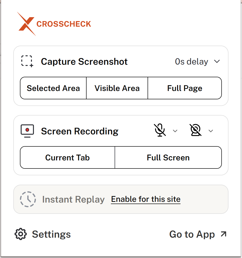
Crosscheck is a free Chrome extension built for that gap. When a QA engineer hits an accessibility issue, the extension captures a screenshot or screen recording of the interaction, the complete console log, every network request, and the environment details — browser, OS, viewport — then sends a structured bug straight to Jira, Linear, ClickUp, GitHub, or Slack. The developer sees the conditions, not a description of them.
Try Crosscheck free and shorten the path from "screen reader behaved oddly" to "developer reproduces in a minute".

 Add to Chrome