Mobile testing vs web testing: where the disciplines really diverge
Mobile testing and web testing share the goal — shipping software that works for the user in front of it — but the constraints have almost nothing in common. Web testing assumes a browser, stable HTTP transport, and a deployment that reaches every user the moment it goes live. Mobile testing assumes a fragmented OS landscape, hardware sensors, gesture vocabularies, intermittent networks, and an app-store review queue that can hold a fix for days. Treating the two as one practice is the fastest way to ship a regression on a Pixel that nobody in the office owns.
This guide breaks down the differences that actually matter in 2026 — device fragmentation, gestures, permissions, app-store cycles, offline behavior — and the tool choices that follow. Appium, XCUITest, Espresso, Detox, and Maestro on the mobile side. Playwright and Cypress on the web side. When to lean on which, and where responsive design testing sits between them.
TL;DR — what changes when you move from web to mobile QA:
- Device matrix replaces browser matrix. Android 15, 16, 14, 13, and 11 all hold meaningful share at once — per Google's December 2025 distribution, no single version is above 20%.
- Gestures become a first-class test surface. Tap, long-press, swipe, pinch, pull-to-refresh, and orientation transitions all need explicit coverage.
- Networks are unstable by default. Offline-tolerant flows, retry queues, and sync-on-resume are QA scope, not just engineering scope.
- Releases ship through stores, not deploys. App Store review and slow upgrade cycles mean multiple versions are always live at once. Backward-compat testing matters more.
- Tool stacks split cleanly. Appium and Maestro are cross-platform; XCUITest, Espresso, and Detox are platform-or-framework-native; Playwright and Cypress own the modern web side.
What we mean by mobile testing vs web testing
Web testing covers any application served over HTTP and rendered by a browser engine — desktop or mobile browser, doesn't matter. The execution environment is Chromium, Gecko, or WebKit, and the artifact under test is HTML, CSS, and JavaScript delivered from a server.
Mobile testing covers native and hybrid apps installed on a phone or tablet — distributed through the App Store, Google Play, or enterprise MDM. They run directly on iOS or Android, talk to hardware APIs (camera, GPS, biometrics), and live inside an OS lifecycle the web never touches — backgrounding, push notifications, permission prompts, system memory pressure.
The line gets fuzzy with mobile web (a responsive site viewed on a phone) and hybrid apps (a WebView wrapped in a native shell — Cordova, Ionic, Capacitor, React Native WebView). Mobile web is web testing on a smaller viewport. Hybrid apps are mobile testing where one of the surfaces is a browser engine. The framework you pick depends on which surface dominates the user journey.
According to StatCounter data reported across Q1 2026, mobile devices account for roughly 52-64% of global web traffic depending on whether tablets are bundled in — meaning the same product almost certainly serves both surfaces, and QA coverage has to follow.
Difference one: device and OS fragmentation
Web fragmentation is real but bounded. Most users sit on a recent Chrome, Safari, Edge, or Firefox build, and auto-update keeps the tail short. Four engines, three operating systems, and you've covered the majority.
Mobile fragmentation is structural. Per Google's December 2025 distribution, Android 15 leads at around 19.3%, Android 14 at 17.2%, Android 13 at 13.9%, Android 11 at 13.7%, and Android 16 is already at 7.5% — no single version dominates. StatCounter's January 2026 read puts Android 15 closer to 22.5%. Either way, a 4-to-5-version spread is the working assumption. Layer on manufacturer skins — Samsung One UI, Xiaomi MIUI, OnePlus OxygenOS, Nothing OS — and "Android" stops being one operating system in any practical sense. iOS is narrower because Apple controls the hardware, but older iPhones that can't run the latest iOS still hold meaningful share.
What this changes in practice:
- Maintain a tiered device matrix. Tier 1 covers the OS-plus-manufacturer combinations that account for ~80% of active users — test every release. Tier 2 covers the long tail — test major releases or when something looks unstable.
- Use a cloud device lab (BrowserStack, LambdaTest, Sauce Labs, AWS Device Farm) instead of buying twenty phones.
- Treat manufacturer skin behavior as its own test variable. Samsung's notification handling and Xiaomi's aggressive battery optimization both kill background flows that work fine on stock Android.
Difference two: gestures and touch interaction
Desktop web testing has a closed vocabulary: click, double-click, hover, scroll, type. Selenium has handled this competently for over a decade.
Mobile is a different surface entirely. The expected interaction set includes tap, double-tap, long-press, swipe in four directions, pinch-to-zoom, drag-and-drop, pull-to-refresh, multi-touch, shake, force-press, and orientation transitions. Each is a potential failure point — tap targets too small to hit, swipes that conflict with the OS's edge-swipe navigation, long-presses that should but don't trigger a context menu. Mobile web sits awkwardly in the middle: the browser interprets touch through its own gesture layer, which diverges from native behavior in subtle ways across Safari iOS, Chrome Android, and Samsung Internet.
WCAG 2.2 matters here. Success Criterion 2.5.8 (Target Size Minimum, Level AA) requires interactive targets to be at least 24 by 24 CSS pixels or have at least 24px of spacing to adjacent targets. The stricter AAA criterion (2.5.5) requires 44 by 44. Apple's HIG recommends 44 by 44 points, Material Design recommends 48 by 48 dp — most teams aim for the platform conventions because the WCAG floor is genuinely a floor, not a target.
Tool choices for gesture testing:
- Appium — cross-platform gesture support via the W3C Actions API, with platform drivers (XCUITest, UiAutomator2, Espresso) underneath.
- Maestro — declarative YAML flows; lower setup cost than Appium and significantly faster time-to-first-test.
- Espresso (Android) and XCUITest (iOS) — native, in-process, faster and less flaky than WebDriver-based tools, at the cost of being platform-locked.
- Detox — gray-box for React Native, with automatic sync on bridge activity and animations.
Manual exploratory testing on real devices still earns its keep for haptic feedback, gesture timing, and edge cases automation doesn't simulate accurately.
Difference three: OS permissions, sensors, and background lifecycle
Web permissions are a small set of browser dialogs — geolocation, camera, microphone, notifications, clipboard. Familiar prompts, limited failure modes.
Mobile permissions are deeper. iOS and Android gate camera, microphone, photo library, contacts, location (foreground-only, while-using, and always variants), Bluetooth, motion data, biometrics, and push notifications. Each can be granted, denied, denied with "don't ask again," or revoked from system settings mid-flow. Every state is a path the app has to handle. The lifecycle is also richer — a mobile app gets backgrounded by a phone call, foregrounded by a notification tap, terminated under memory pressure, and resumed hours later. State has to survive every transition, or the bug report ends up titled "app crashed when I came back from a call."
Test scope on the mobile side should include:
- Permission denial paths for every protected API — including the "don't ask again" path where re-prompting requires deep-linking into settings.
- Interruption handling — incoming call mid-flow, OS dialogs overlaying the app, lock screen during a transaction.
- Background-to-foreground recovery for any flow that touches the network or session state.
- Push notification handling when the app is killed, foregrounded, or on a different screen.
Web QA touches almost none of this. The lifecycle is the page load and tab close, with a small middle ground for visibilitychange.
Difference four: networks, offline behavior, and sync
Web testing largely assumes a working connection. Slow-network performance matters for Core Web Vitals and conversion, but a page with no network usually just shows an error and waits.
Mobile is the opposite. Users move between Wi-Fi, 5G, LTE, 3G, and dead zones in a single commute. Native apps are expected to absorb that variability — caching enough to be useful offline, queuing writes for later sync, surfacing connectivity state without blocking the user, and reconciling on reconnect.
What this adds to the QA scope:
- Offline launch — does the app open without a network, and what does it show?
- Mid-flow disconnection — start a transaction on Wi-Fi, drop to no signal, reconnect on cellular. Does it complete, retry, or surface a clear error?
- Background sync — queue writes offline, kill the app, restore network, relaunch. Did the writes go through?
- Network transitions — Wi-Fi to cellular, VPN connect, captive portal interception. Each breaks naive HTTP clients.
Charles Proxy, Proxyman, Mitmproxy, and Fiddler handle inspection and throttling. Xcode's Network Link Conditioner and Android Studio's emulator presets simulate 3G/4G/5G and packet loss. Appium and Maestro both let tests toggle airplane mode inline. On the web side, Chrome DevTools throttling and Playwright/Cypress request interception cover most cases. Service workers and installed PWAs blur the line — a well-built PWA needs the same offline-tolerance testing a native app does.
Difference five: deployment, app-store cycles, and version sprawl
A web deploy is immediate. Ship to production, next request gets the new bundle, the old version is gone. Rollback is a revert or a feature-flag flip.
Mobile is the opposite. Build an IPA or AAB, sign it, submit to the App Store or Google Play, wait for review (hours on Google Play, days on App Store), then wait for users to install. None of that is under the team's control. The result: multiple versions of the app are always in production at once. Some users will be on a build you shipped six months ago.
What this does to QA scope:
- Backward compatibility becomes a real concern. A backend schema change has to work for the version of the app a user installed last quarter, not just the one in your pipeline.
- Forced-upgrade flows need their own coverage. If you must break compatibility, the older app needs to detect it and prompt to update — without losing data.
- Pre-release smoke testing matters more. A bug that ships to the store is expensive to fix; a bug that ships to a web deploy is a hotfix.
- Staged rollouts (TestFlight, Google Play internal tracks, percentage rollouts) become part of the release plan, not a nice-to-have.
That asymmetry is the cleanest argument for investing more heavily in pre-release mobile QA. A web bug can be patched within the hour. A mobile bug lives for days minimum, often weeks.
Tool landscape in 2026: mobile vs web
The two stacks have very little overlap.
Mobile
| Tool | Scope | Best for |
|---|---|---|
| Appium | Cross-platform (iOS, Android, Windows, more) | Teams that need one framework across multiple platforms and language bindings |
| Maestro | iOS, Android, web flows | Fast time-to-first-test (10-15 minutes), YAML-based, low flakiness, accessible to non-engineers |
| XCUITest | iOS only | Native Xcode integration, fastest and most stable for iOS-only teams |
| Espresso | Android only | In-process testing, auto-sync with UI thread, fast and stable for Android-only teams |
| Detox | React Native (iOS + Android) | Gray-box testing with automatic sync on JS bridge and animations |
| BrowserStack / Sauce Labs / LambdaTest / AWS Device Farm | Cloud device labs | Real-device testing at scale without maintaining a physical lab |
| Charles / Proxyman / Mitmproxy | Network inspection | Traffic interception, throttling, payload debugging |
Trade-offs: Appium is broadest and most flexible but slower than native tools — Espresso is reported to run 3-5x faster, XCUITest up to ~50% faster on the same flows. Maestro launched in 2022 and has been picked up quickly because YAML lowers the floor for who can write tests. Detox is narrow but excellent inside React Native, with sub-2% flakiness thanks to gray-box synchronization.
Web
| Tool | Scope | Best for |
|---|---|---|
| Playwright | Chromium, Firefox, WebKit | Modern cross-browser automation with parallel execution, auto-waiting, trace viewer |
| Cypress | Chromium-based, Firefox, WebKit (experimental) | Developer-friendly DX, time-travel debugger, component testing |
| Selenium | All major browsers, all major languages | Legacy estates, polyglot teams, deepest grid ecosystem |
| Chrome DevTools | All Chromium browsers | Manual debugging, throttling, Lighthouse audits |
| Percy / Chromatic / Applitools | Visual regression | AI-diffing across breakpoints in CI |
| Lighthouse / WebPageTest | Performance and Core Web Vitals | LCP, CLS, INP baselines per release |
Playwright continues to take share on new suites — auto-waiting, multi-context isolation, and the trace viewer have made it the default pick for greenfield web QA. Cypress remains strong for component-level work and teams that value DX over breadth. Selenium is still the right pick for polyglot estates and large legacy grids. For a deeper comparison, see Selenium vs Playwright vs Cypress and the best test automation frameworks for 2026.
Responsive design testing: the bridge between both worlds
Responsive design testing is technically web testing — you're inside a browser — but the failure modes it hunts are the ones mobile users hit: broken layouts on narrow viewports, tap targets too small to land, text overflowing its container, inputs that don't trigger the right keyboard, navigation built for a mouse but used with a thumb.
What to cover:
- Layout integrity across every defined breakpoint — no overlapping elements, no horizontal scroll on mobile.
- Tap target sizing — WCAG 2.2 AA floor is 24 by 24 CSS pixels (or 24px spacing); aim for Apple's 44x44 or Material's 48x48 for important controls.
- Typography legibility on high-density screens.
- Form behavior — correct
inputmode, labels visible with the keyboard up, error states readable at 375px. - Image and media scaling, including
srcsetselection on high-DPI displays. - Orientation transitions without losing state.
Chrome DevTools Device Toolbar handles fast iteration; BrowserStack and LambdaTest cover real-device validation; Percy, Chromatic, or Applitools cover visual regression in CI; Lighthouse audits mobile performance and accessibility in the same run. Emulators get you through the first 90% of layout work, but font rendering, touch sensitivity, and hardware acceleration only show up on actual phones.
Where each discipline borrows from the other
A few patterns now cross the boundary in both directions.
AI-assisted test generation has moved from novelty to working tool in 2026 — Maestro Studio, Mabl, Testim, and Playwright's Copilot integration generate flows from natural-language descriptions or recorded sessions. Authoring time drops; review time doesn't, because generated assertions miss edge cases a tester would catch.
Self-healing locators appear in commercial tools (Mabl, Testim, Functionize) and experimental Playwright plugins. They reduce maintenance churn without eliminating it — a renamed component still breaks tests, the question is how often the framework guesses correctly.
Visual regression with AI diffing (Percy, Chromatic, Applitools) is table stakes for web and increasingly common for mobile.
Accessibility-as-CI has accelerated since the European Accessibility Act came into force on June 28, 2025. Failing builds on Axe violations is now common practice. The same Axe-core engine drives web and mobile-web auditing; native mobile accessibility (Android's accessibility tree, iOS's UIAccessibility) needs separate tools but the same operating principle.
For deeper coverage, see the best AI testing tools for 2026 and the best accessibility testing tools mapped to WCAG.
Choosing where to invest
The balance between mobile and web QA follows the user base, not the team's existing skill set. Three things to check:
- Where is your traffic? Pull the last 90 days of analytics. Mobile share, browser distribution, OS-version distribution, geography. The numbers tell you where coverage needs to be deepest.
- What's the cost of a production bug on each surface? A web bug is a hotfix away from closed. A mobile bug ships when the next store review approves it. That argues for heavier pre-release investment on mobile and faster bug-reporting infrastructure on web.
- What's your release cadence? Daily web deploys and biweekly mobile releases need different test pyramids. Web can lean harder on regression-in-CI; mobile needs heavier exploratory and device-matrix work before each submission.
The teams that do this well keep separate matrices for each surface and accept that the discipline boundary is real — the same person can cover both, but the tools, timelines, and failure modes don't transfer cleanly.
FAQ
Is mobile testing harder than web testing?
Different, not harder. Mobile has a larger surface area (devices, OS versions, gestures, permissions, lifecycle, networks, app-store cycles), but each piece is well-understood. Web is narrower but moves faster — browser engines, new web platform APIs, and Core Web Vitals shift the target every quarter. The cost depends on the breadth your user base demands.
Can one team own both mobile and web QA?
Yes, and most teams under about 30 engineers do. The underlying skills — exploratory testing, bug-report quality, test pyramid design, CI integration — transfer cleanly. Day-to-day tool fluency doesn't. A QA engineer who lives in Playwright is not automatically productive in Appium next week.
Should mobile web be tested with web tools or mobile tools?
Web tools, primarily. A responsive site on a phone is still a browser-hosted application, so Playwright, Cypress, and Selenium are the right primary stack — paired with real-device validation through BrowserStack or LambdaTest. Use mobile tools (Appium, Maestro) only for hybrid apps or installed PWAs where the WebView lifecycle matters.
What's the right device matrix for Android in 2026?
Start from your own analytics. Build a Tier 1 covering the OS versions and manufacturers that account for ~80% of active users — typically Android 14, 15, and 16 across Samsung, Pixel, and one or two other significant manufacturers in your geography. Add Tier 2 for Android 13 and the long tail. Refresh quarterly; share shifts faster than it used to.
How does Crosscheck fit into mobile vs web testing?
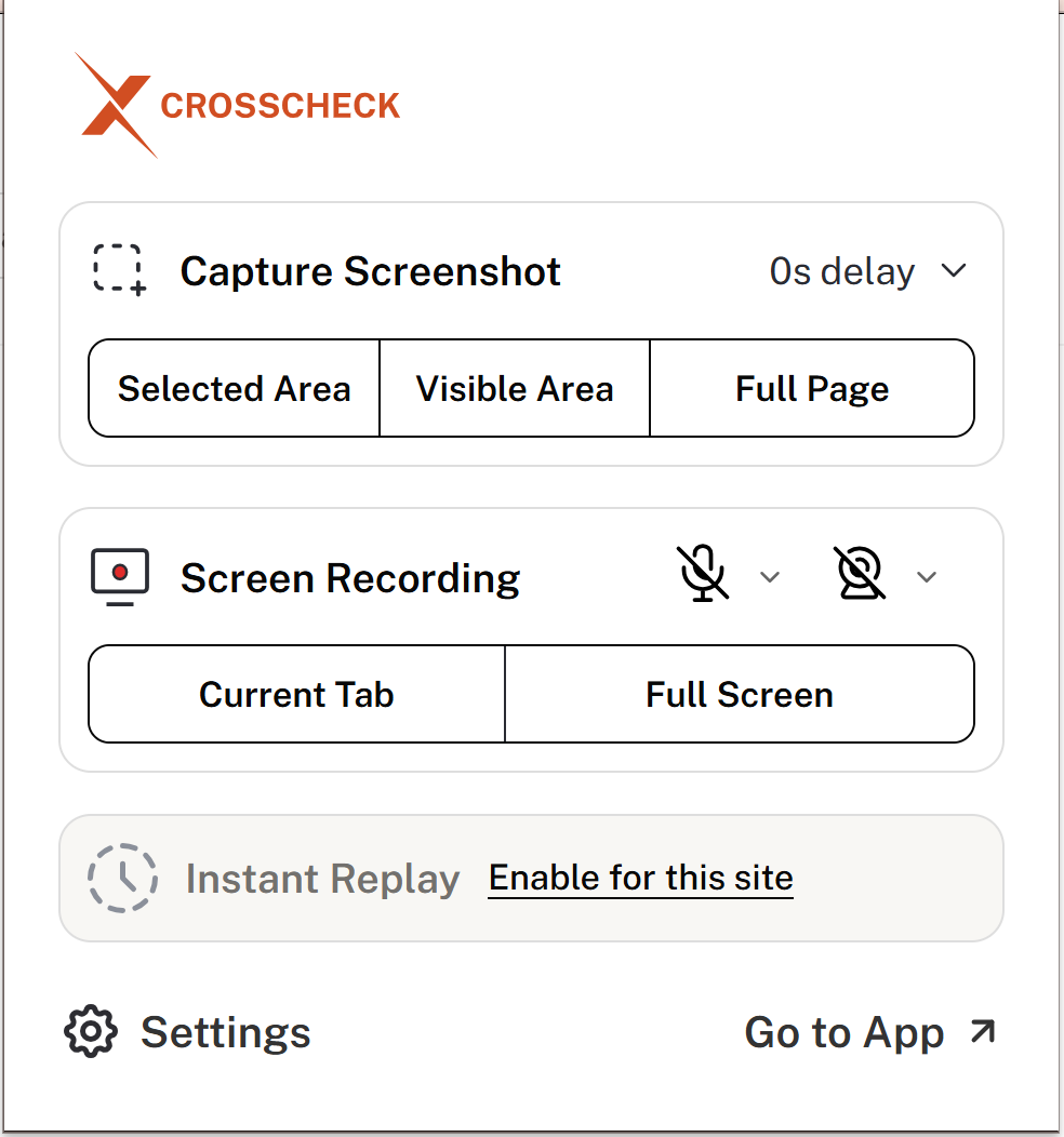
Crosscheck is a free Chrome extension for visual bug reporting on web applications — screenshots, screen recordings, console logs, and network requests at the moment a tester finds a bug, routed to Jira, Linear, ClickUp, GitHub, or Slack. It's a web-side tool. The mobile equivalent — capturing full device state when a bug happens — is solved by platform tools like sysdiagnose, adb bugreport, and dedicated mobile bug-reporting SDKs.
Tighten your web bug reports while you're at it
Web bugs are environment-specific by nature — tied to a browser version, a viewport, a sequence of actions, or a network response that fails under specific conditions. The harder a bug is to reproduce, the more context the initial report has to carry.
Crosscheck captures console logs, network requests, performance metrics, and the user-action sequence the moment a bug is reported in a Chromium browser, and attaches the full bundle to a Jira, Linear, ClickUp, GitHub, or Slack ticket automatically. Developers receive a reproduction-ready report instead of a description of symptoms. Free, no usage caps.

 Add to Chrome